Collection of bad / confusing UI
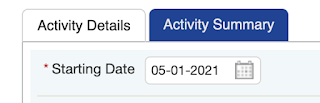
In this post I want to share some examples of UIs that I find really confusing. Maybe you'll agree or maybe you won't but I think it's still fun to show what I think is bad UI. It's probably going to be an ongoing post - because I always find sites that are confusing online. I won't tell which site it comes from so that we can keep them anonymous. I've wanted to write this post a while ago but never did. There's a saying that goes by "better now than never" 1. This tab color is really strange to me. Which one is currently selected? Every time I use this, I end up clicking on "Activity Details" (light colored one) but that one is already selected. The one not selected is the one in dark blue. I don't think there's a right and wrong here but my brain cannot come to the conclusion that the light white background color is the selected one. More to come!